March 15, 2026
Implementing Figma's Glass Effect with SVG Filters
A while back, I spotted a glass effect on a design file and went straight to Figma's community playground to see how it worked. It looks amazing!
Last year, Figma shipped a glass material that goes beyond the old frosted-glass blur — it refracts, catches light, and splits color at its edges, making UI feel like real glass. This came shortly after Apple introduced Liquid Glass at WWDC 2025, the biggest visual change since iOS 7. I couldn't resist rebuilding it for the browser.
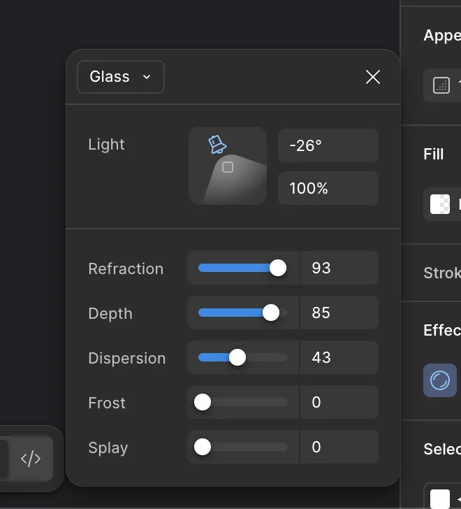
Figma's glass panel exposes these controls:
This project uses backdrop-filter with SVG filter references (url(#...)). Check
browser support before diving in — note that
SVG filter references via url() have had edge cases in older Firefox versions beyond
basic backdrop-filter support.
Take a Look
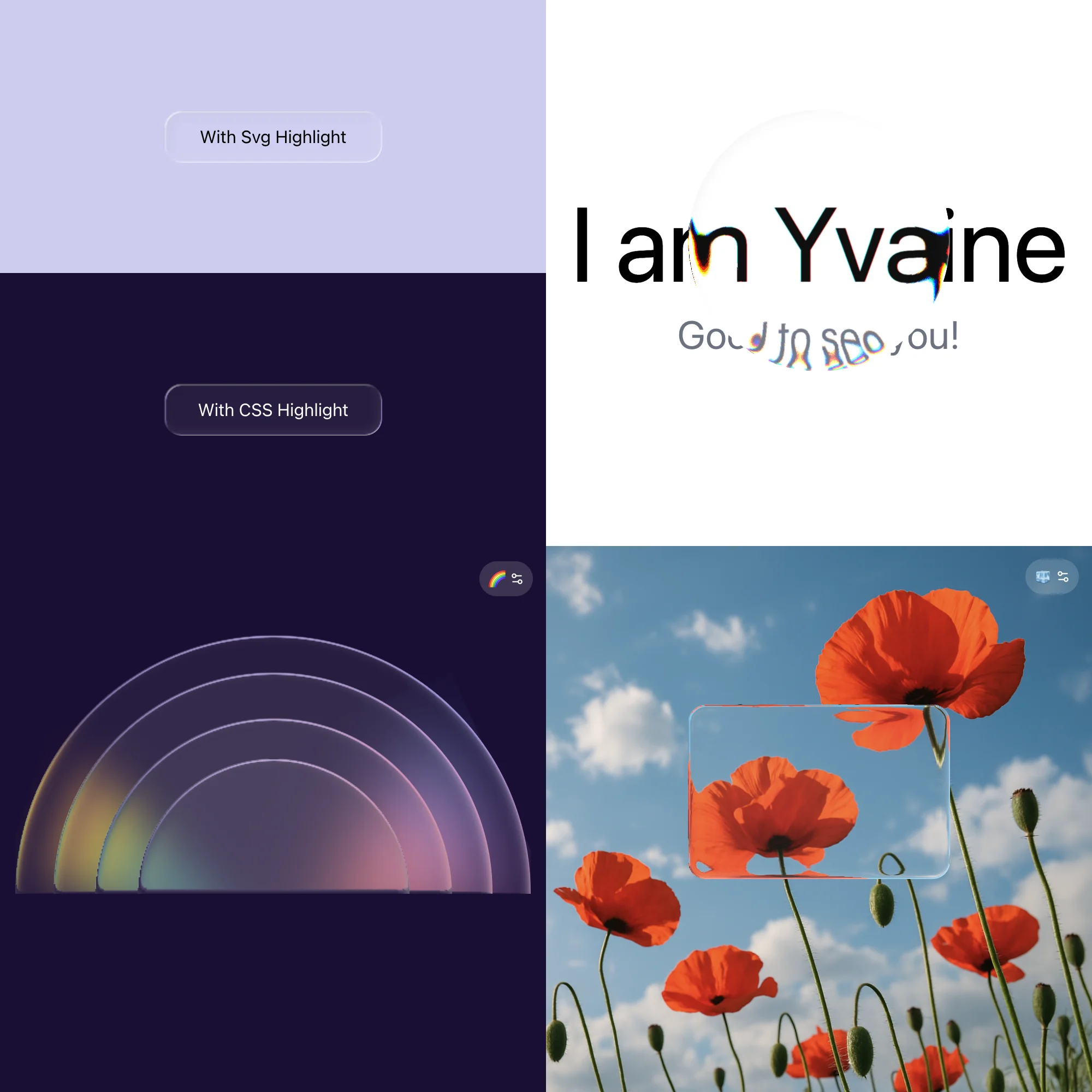
Open the live demo and play with it while reading.
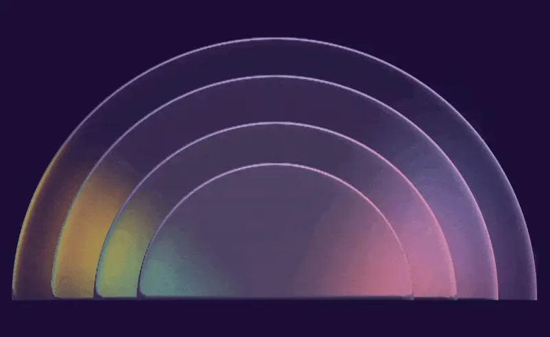
What Does Glass Look Like?
Before diving into the implementation, it helps to break down what the human eye actually sees when looking through glass.
Here are the key visual traits that make glass look like glass:
-
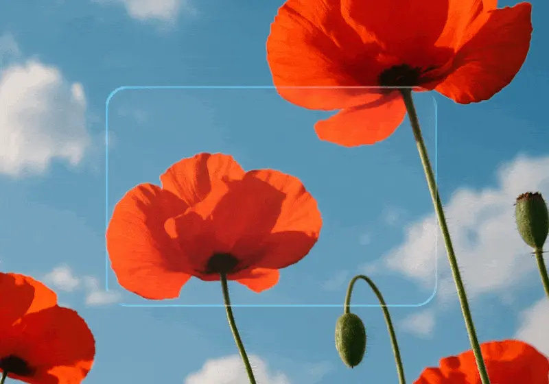
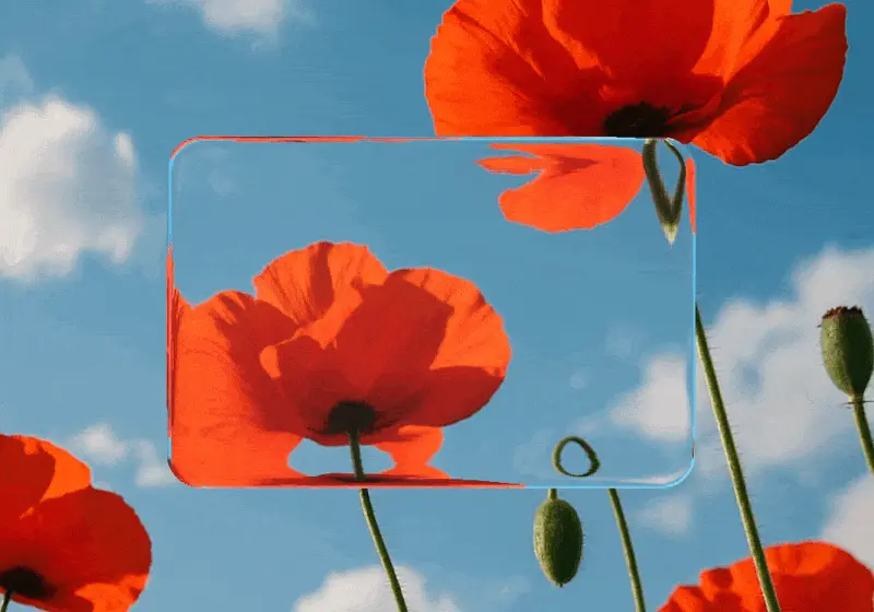
Transparency
We can see the content behind the glass.
-
Refraction
Content bends and distorts near the glass edges, as if viewed through a curved lens.
-
Light direction
The position of the light source determines where shadows and highlights fall on every card.
-
Frost
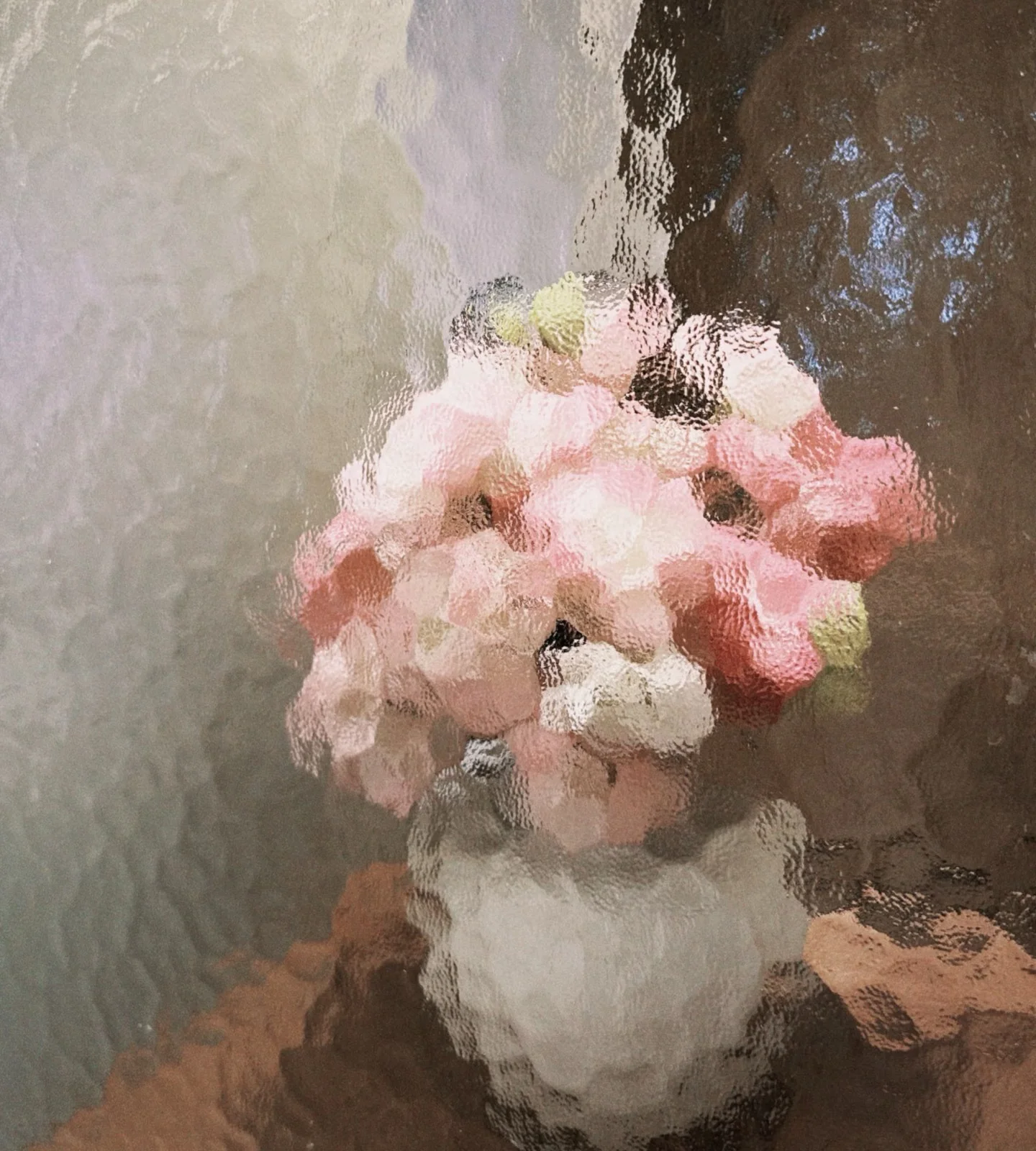
Frosted or textured glass provides a hazy, matte finish that softens the content behind it.
-
Glass-on-glass stacking
Each layer refracts not just the background but also the layers behind it.
Why I Built My Own
There are already great implementations out there — rdev/liquid-glass-react has an impressive demo, and archisvaze/liquid-glass takes a clean vanilla SVG filter approach with no layout assumptions. I ended up building on top of archisvaze's demo, rebuilding it with React + TypeScript and matching the controls to Figma's parameters while targeting a few specific scenarios:
- Light-colored solid backgrounds
- Configurable light angle
- Full-perimeter depth effect (not just corners)
- Light-aware inner shadows
- Chromatic dispersion on light backgrounds with dark text
SVG Filter Layers
Here's the complete pipeline from backdrop to final output. Each step in this diagram maps to one or more of the visual traits above.

A few things need to be called out:
-
colorInterpolationFilters="sRGB"SVG filters default to linearRGB, but design tools like Figma work in sRGB. Screen blend and saturate math produces different results in each color space. Set
colorInterpolationFilters="sRGB"on the root<svg>to match. -
Dispersion
When dispersion is 0, a single
feDisplacementMaphandles refraction for all channels uniformly. When dispersion > 0, the Dispersion row replaces it: R/G/B are split, displaced with slightly different scales, then recombined. The two paths are mutually exclusive. -
Saturation
Not a user control. Curved glass tends to concentrate light, making colors appear more vivid at the edges.
saturate=4exaggerates this for visual effect, masked to the specular highlight zone viafeComposite(in)so it only applies where the highlight exists. -
Inner Shadow / Highlight
Observed from Figma's glass effect: edges facing the light cast a subtle inward shadow, while opposite edges glow. This matches Apple's Liquid Glass three-layer material model (highlight, shadow, illumination).
-
Light Angle
Sets a light direction vector used by two maps. The specular highlight (the Light Intensity row in the diagram) uses
Math.abs(dot), so both edges facing and away from the light produce a glint, with intensity varying by angle. The inner shadow/highlight is directional (no abs): edges facing the light cast an inward shadow, edges facing away produce an inner highlight. Changing the angle rotates which edges are shadowed and which are highlighted.
The maps are pixel-matched to each card's size and border radius, so each card needs its own filter (see Scalability below).
Parameter Deep Dive
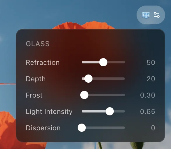
Refraction
Controls how strongly the glass bends light.
Under the hood, it maps to two physics-inspired values: the index of refraction (IOR) and glass thickness. Real glass has an IOR around 1.5; this slider extends the range up to 5 for a more dramatic visual effect.
1// refraction 0–100 → IOR [1,5] + glassThickness [10,200]
2function refractionToParams(refraction: number) {
3  const t = refraction / 100
4  return {
5    ior: 1 + t * 4, // range: [1, 5]
6    glassThickness: 10 + t * 190, // range: [10, 200]
7  }
8}
These values feed into a Snell's law solver. The glass edge follows a squircle curve defined in the displacement map generator:
1const SURFACE_FN = (x) => Math.pow(1 - Math.pow(1 - x, 4), 0.25)This gives a smooth, slightly flattened dome shape. For 128 sample points along this curve, the code calculates the surface slope, then uses Snell's law to figure out how much the light bends at that point:
1function refract(nx, ny) {
2  const dot = ny
3  const k = 1 - eta * eta * (1 - dot * dot)
4  if (k < 0) return null // total internal reflection
5  const sq = Math.sqrt(k)
6  return [-(eta * dot + sq) * nx, eta - (eta * dot + sq) * ny]
7}
The result gets baked into a displacement map, a canvas image where the red channel stores horizontal offset and the green channel stores vertical offset. Mid-gray (128) means no displacement. This image then drives feDisplacementMap in the SVG filter, a filter primitive that reads per-pixel offsets from an image (R for X, G for Y, 128 as the neutral point) and shifts the input pixels accordingly, actually bending the backdrop.
For each pixel, roundedRectSDF returns the distance to the nearest edge and the outward-facing normal. This replaces the corner-only geometry from the original demo: straight sides and corners are treated uniformly, so the refraction effect wraps around the entire card perimeter.
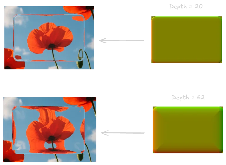
Depth
Controls how far the refraction zone extends inward from the edge, measured in pixels. Thanks to roundedRectSDF, this effect covers the entire perimeter (straight sides and corners alike), not just rounded corners.
At low values, refraction is barely visible, just a thin shimmer along the border. At max, the refraction zone eats into most of the card, creating a heavily domed look. The maximum depth is constrained by card size: min(width, height) / 2 - 1, so it can never exceed half the shorter dimension.
The right side shows the displacement map at two depth values; the left side shows the resulting refraction on the card:
Frost
Higher values produce stronger background blur.
It maps directly to feGaussianBlur's stdDeviation, the very first step in the filter:
1<feGaussianBlur in="SourceGraphic" stdDeviation={blurAmt} result="blurred_source" />Light Intensity
This controls the brightness of the specular highlight, the bright glint along the glass edge that makes it look 3D. The highlight map is generated pixel by pixel, using a highlight zone 2.5x wider than the refraction bezel so the glint extends further than the distortion:
1// nx, ny from roundedRectSDF; sv is the light direction vector
2const dot = Math.abs(nx * sv[0] + -ny * sv[1])
3const edge = Math.sqrt(Math.max(0, 1 - (1 - Math.max(0, fromEdge)) ** 2))
4const alpha = (255 * Math.pow(dot * edge, 1.5) * op) | 0
dot measures how much each edge pixel's normal aligns with the light direction.
edge fades the highlight smoothly toward the inner boundary.
op is a 1px anti-aliasing feather at the outer edge: 1 inside the shape, fading to 0 just outside.
alpha combines all three into the final brightness per pixel. The output is white pixels with varying alpha, forming a glow along the entire perimeter, brightest where the edge faces the light.
In the SVG filter, this map's opacity is controlled by:
1<feComponentTransfer in="spec_layer" result="spec_faded">
2  <feFuncA type="linear" slope={lightIntensity} />
3</feComponentTransfer>
Dispersion
Controls how much color splits at the refractive edges.
feDisplacementMap moves all color channels by the same amount. It has no concept of wavelengths. So if you just apply it directly, red, green, and blue all shift together. No rainbow, no dispersion.
To get chromatic splitting, you have to work around this limitation. The idea: isolate each color channel, displace them with slightly different strengths, then blend them back together.
1{/* Isolate R, G, B channels */}
2<feColorMatrix in="blurred_source" type="matrix"
3  values="1 0 0 0 0  0 0 0 0 0  0 0 0 0 0  0 0 0 1 0"
4  result="src_r" />
5<feColorMatrix in="blurred_source" type="matrix"
6  values="0 0 0 0 0  0 1 0 0 0  0 0 0 0 0  0 0 0 1 0"
7  result="src_g" />
8<feColorMatrix in="blurred_source" type="matrix"
9  values="0 0 0 0 0  0 0 0 0 0  0 0 1 0 0  0 0 0 1 0"
10  result="src_b" />
11
12{/* Displace each channel with a slightly different scale */}
13<feDisplacementMap in="src_r" in2="disp_map"
14  scale={scale * (1 + (dispersion / 100) * 0.15)}
15  xChannelSelector="R" yChannelSelector="G"
16  result="disp_r" />
17<feDisplacementMap in="src_g" in2="disp_map"
18  scale={scale}
19  xChannelSelector="R" yChannelSelector="G"
20  result="disp_g" />
21<feDisplacementMap in="src_b" in2="disp_map"
22  scale={scale * (1 - (dispersion / 100) * 0.15)}
23  xChannelSelector="R" yChannelSelector="G"
24  result="disp_b" />
25
26{/* Recombine channels */}
27<feBlend in="disp_r" in2="disp_g" mode="screen" result="disp_rg" />
28<feBlend in="disp_rg" in2="disp_b" mode="screen" result="displaced" />
Splay (Not Implemented)
Adjusts the spread of how light bends around edges, making overlaying elements more visible. Unlike Depth (which controls how thick the glass material appears at the edge), Splay affects the optical spread of light itself. In practice, the two effects easily couple, making it hard to control them independently. Not included in this implementation.
Inner Shadow: SVG Pixel Maps vs CSS box-shadow
I built both approaches to see which looks better.
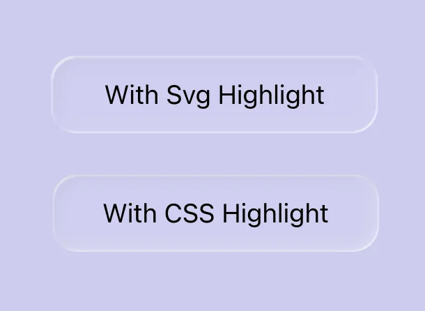
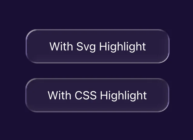
The SVG Way
Generates pixel maps using roundedRectSDF, the same signed distance field that drives the displacement and specular maps. For every pixel near the edge, it returns the outward-pointing normal and dots it with the light direction:
1const dot = nx * lightDir[0] + ny * lightDir[1]
2if (dot < 0) {
3  // Edge faces the light → shadow (glass edge blocks light inward)
4  sd[idx + 3] = Math.min(255, (255 * -dot * fade * fade * 0.1) | 0)
5} else {
6  // Edge faces away → highlight (light refracts through the edge)
7  hd[idx] = hd[idx + 1] = hd[idx + 2] = 255
8  hd[idx + 3] = Math.min(255, (255 * dot * fade * fade * 0.2) | 0)
9}
This produces two images (shadow + highlight) fed into the filter chain as feImage nodes, roughly 100 lines of code plus 4 extra filter steps.
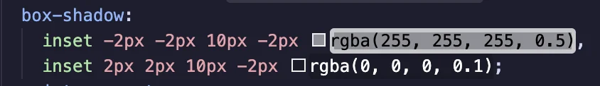
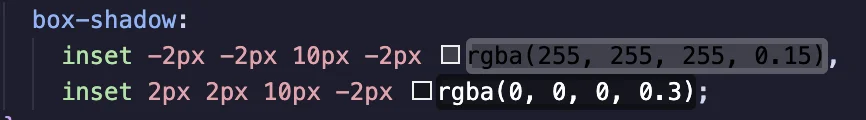
The CSS Way
Uses box-shadow on the card's ::before pseudo-element, with a custom property to toggle between shadow and highlight:
1.figma-glass-css::before {
2  content: "";
3  position: absolute;
4  inset: 0;
5  z-index: -1;
6  border-radius: inherit;
7  background-color: rgba(255, 255, 255, 0.06);
8  box-shadow:
9    inset -2px -2px 10px -2px rgba(255, 255, 255, 0.5),
10    inset 2px 2px 10px -2px rgba(0, 0, 0, 0.1);
11  pointer-events: none;
12}
Shadow color and intensity should adapt to the background—lighter backgrounds need stronger highlights and lighter shadows, darker backgrounds the reverse.
CSS vs SVG comparison:
-
Code complexity
CSS is ~5 lines (box-shadow + pseudo-element). SVG is ~120 lines (roundedRectSDF + per-pixel map generation + 4 filter nodes).
-
Border radius
box-shadowfollowsborder-radiusautomatically. The SVG version manually computes the rounded rect distance field, same visual result. -
Highlight gradient
CSS shadow direction is fixed by the offset values (
-2px/-2px). The SVG version dots each pixel's normal with the light direction, so gradients rotate withlightAngle. So, if you change the light angle, remember to switch the CSS version to the opposite shadow (highlight vs shadow) for the new angle.
Scalability
The displacement, specular, and inner shadow maps are all pixel-matched to each card's exact width, height, and border radius. This means filters can't be shared across different-sized cards. Each card instance generates its own set of canvas maps and gets its own <filter> definition with embedded data URLs.
For a few showcase cards on a page, this is fine. At scale, N cards means N canvas renders and N in-memory PNG images on mount. This approach works best for hero sections or feature showcases, not as a general-purpose component used dozens of times.
To manage multiple cards, each one uses React's useId() to generate a unique filter ID:
1const rawId = useId()
2const filterId = `liquid-glass-css-${rawId.replace(/:/g, "")}`
The ID is passed to the DOM through a CSS custom property:
1<div style={{ "--glass-filter": `url(#${filterId})` }}>And the ::after pseudo-element applies it:
1.figma-glass-css::after {
2  backdrop-filter: var(--glass-filter);
3}
A ResizeObserver watches each card and regenerates the maps when the size changes.
The per-card canvas render is the main bottleneck of this approach. A WebGL shader could generate maps on the GPU instead, removing this constraint entirely.
What's on My Mind Now
Glass effects mark a step in UI aesthetics: surfaces that refract, catch light, and respond to their environment, rather than flat backgrounds with a blur layer. We've seen this pattern before. iOS 7 stripped everything down to flat. Material brought depth back in a controlled way. Now glass pushes it further into something more expressive, and inevitably, more controversial. Some embrace it, some find it excessive. Design rarely moves by consensus.
WebGL could do all of this in real-time via fragment shaders, no pre-baked maps needed. But GLSL is a fundamentally different programming paradigm (parallel, stateless, GPU-native thinking), with heavy boilerplate and painful debugging. A topic for a future post.