February 10, 2025
Generative Animated SVG - Color
Scroll Origins NFT
For more context, check out Generative Animated SVG - Curve.
Just a reminder, our NFT collection boasts five distinct types.
Standard Styles:
- Quintic function curve with a beige background
- Quartic function curve with a cyan background
- Cubic function curve with a rust background


Special Styles:
- Any standard SVG with a rainbow curve
- Any standard SVG with a rainbow background


Even now, seeing them together still leaves me in awe.
Solid Mode
After obtaining the simplified reference SVG, I noticed that the beige version actually uses two shades. Then I told the designer that I needed two shades each for cyan and rust.
For the code, we need to tightly bind the degree and color values, then pass the color to the SVG generation function and the degree to the formula generator.
1const determineDiversity = () => {
2  const current = Date.now()
3  if (current < date2.valueOf() && current >= date1.valueOf()) {
4    return { colors: ["#EDCCA2", "#EBC28E"], degree: 5 }
5  } else if (current < date3.valueOf() && current >= date2.valueOf()) {
6    return { colors: ["#93FBED", "#62E6D4"], degree: 4 }
7  } else if (current < date4.valueOf() && current >= date3.valueOf()) {
8    return { colors: ["#FF684B", "#EE5132"], degree: 3 }
9  }
10  return { colors: ["#EDCCA2", "#EBC28E"], degree: 5 }
11}
By the way, in my editor, it’s very evident. Thanks to the Color Highlight plugin.
Gradient Mode
In SVG, <linearGradient> was used to define amazing linear gradient color.
1<g transform="translate(107.01, 95.71)">
2  <path
3    class="st61"
4    stroke="url(#gradient)"
5    d="M0 58.9594 Q5.1475 43.8068, 19.0479 76.8075 Q46.0658 140.8778, 76.81 76.81 Q95.4768 46.615, 112.0631 76.8113 Q141.2229 184.3478, 153.62 107.3804"
6  />
7</g>
8
9<defs>
10  <linearGradient id="gradient">
11    <stop stop-color="#93FBED" />
12    <stop offset="0.25" stop-color="#F49BFF" />
13    <stop offset="0.64" stop-color="#FFBC4F" />
14    <stop offset="1" stop-color="#FF684B" />
15  </linearGradient>
16</defs>
By default, the default value of gradientUnits is objectBoundingBox, and if gradientTransform isn’t specified, the gradient flows from left to right.
Rainbow line
For the curve, keeping gradientUnits="objectBoundingBox" works wonderfully. The gradient’s bounding box is defined as the smallest rectangle that encompasses all visible parts of the curve. In other words, this rectangle must include the path’s starting point, ending point, and all local extrema (i.e., the minimum and maximum values in both the x and y directions).

Note that the gradient flows from left to right in the coordinate space, not along the path’s curvature. Consequently, the stop colors may not map evenly onto the path, and steeper segments will display a larger portion of their corresponding color.

Rainbow bg
In the original SVG, the background is composed of three closed paths.
The gradient flows from bottom left to top right, so I tried applying gradientTransform="rotate(-45)" to adjust its direction.
1<path
2  class="st45"
3  fill="url(#gradient1)"
4  d="M278.85,3.21H71.12H52.35c10.37,0,18.77,8.4,18.77,18.77v322.64c0,11.42,9.25,20.67,20.67,20.67h205.83 V21.98C297.62,11.62,289.22,3.21,278.85,3.21z"
5/>
6
7<linearGradient id="gradient1" gradientTransform="rotate(-45)">
8  <stop stop-color="#93FBED" />
9  <stop offset="0.25" stop-color="#F49BFF" />
10  <stop offset="0.64" stop-color="#FFBC4F" />
11  <stop offset="1" stop-color="#FF684B" />
12</linearGradient>
However, I got an unexpected result, and it looks nothing like the design.

The issue lies with the gradientTransform.
It rotates the gradient’s coordinate system (basically a rectangle). When this rectangle is rotated 45° counterclockwise, an axis-aligned bounding box is generated as the new gradient coordinate system. This new rectangle is larger than the original, while the path’s objectBoundingBox remains unchanged.
As a result, the color at offset="1" may fall outside the shape, causing the initial colors to stretch and the later colors to disappear.
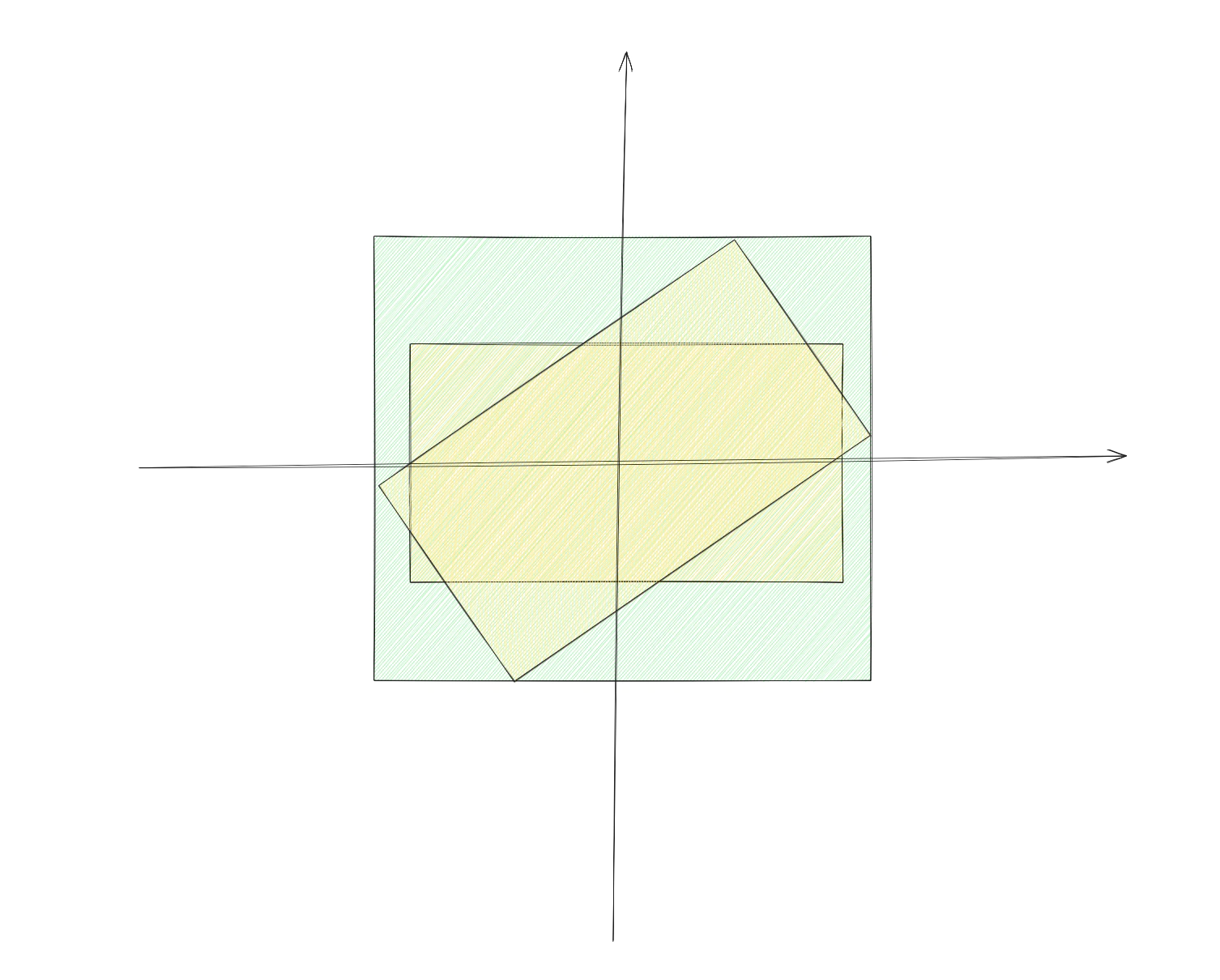
For details on the transformation process, please refer to the diagram below.

So, I turned my attention to another value of gradientUnits: "userSpaceOnUse".
1<linearGradient
2  id="gradient2"
3  x1="61.5358"
4  y1="350.831"
5  x2="374.895"
6  y2="187.201"
7  gradientUnits="userSpaceOnUse"
8>
9  <stop stop-color="#93FBED" />
10  <stop offset="0.25" stop-color="#F49BFF" />
11  <stop offset="0.64" stop-color="#FFBC4F" />
12  <stop offset="1" stop-color="#FF684B" />
13</linearGradient>
userSpaceOnUse makes the gradient coordinate system use the SVG’s user coordinate system, so the colors smoothly transition from (x1, y1) to (x2, y2) using absolute coordinate values.
Therefore, all we need now is to determine the coordinates of the path’s bottom-left and top-right corners.

Stay Tuned
One year later, in 2024, Scroll launched Canvas and another dynamic SVG need to be made, dubbed Heartbeat.
Can’t wait to share its creation process with you all, but the product team needs to discuss some new requirements with me. I’ll be back as soon as possible.

