February 23, 2025
Simulating Heartbeat with SVG Animation
Canvas Heartbeat
In 2024, Scroll launched Canvas, and to date, 784,022 wallet addresses have minted it.
I’m not sure if you’ve noticed, but your Heartbeat changes occasionally. I’d like to share how I created this SVG.

Background
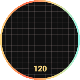
As the avatar of Canvas, it was designed to reflect user's activity level on the chain.
After several days of brainstorming discussions, Heartbeat was decided to look like this. It shocked me with its beauty and complexity.
However, after generating Scroll Origins NFT, I became very confident.

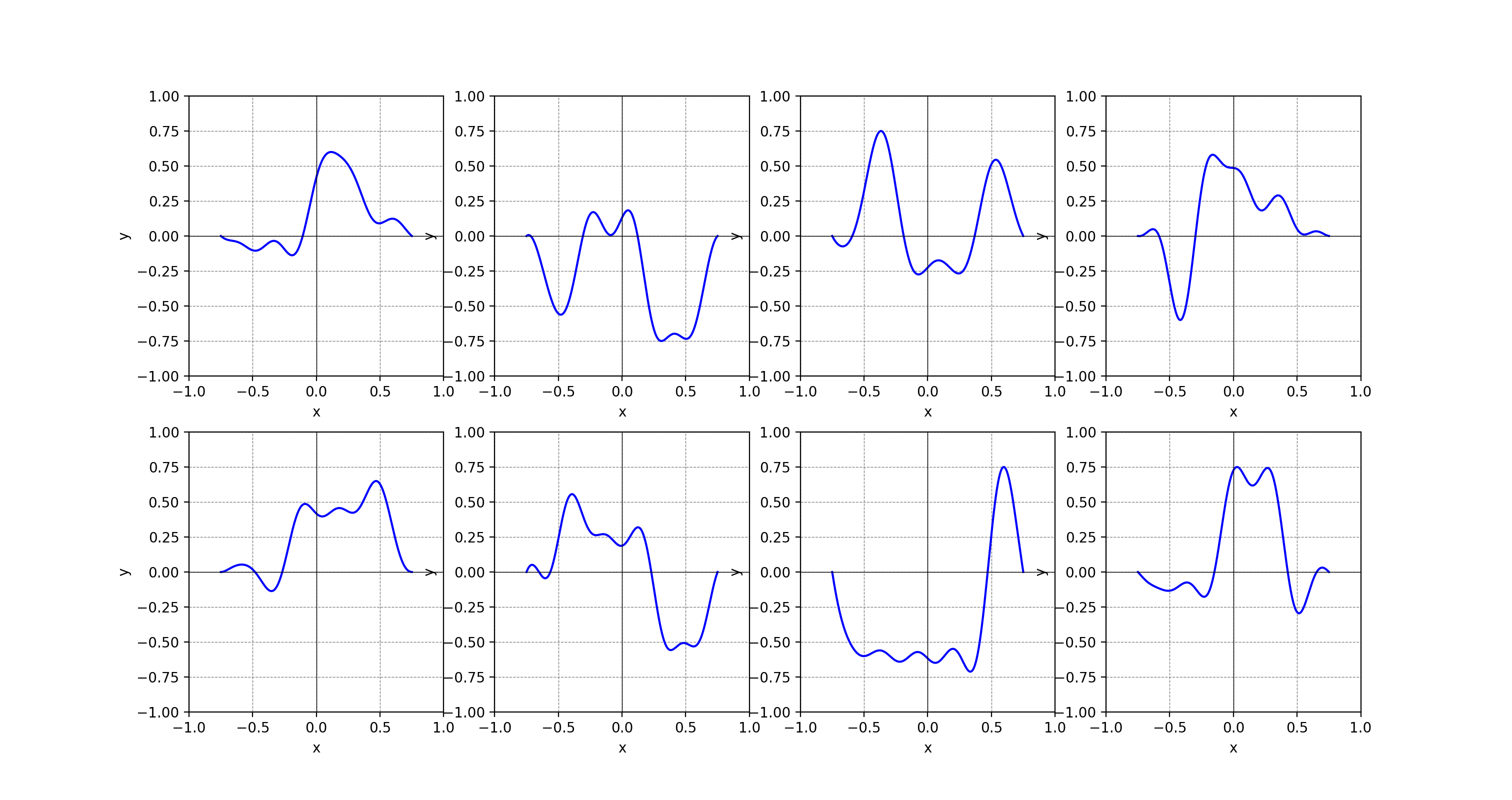
Once again, I received a Python file from the same brilliant researcher. This time, the script returns a set of coordinates to generate a nice-looking waveform using the Fourier Series.
Well, let me stitch these two pieces of art together, again.
Requirements
Firstly, analyzing requirements is key, as different people have various opinions and aesthetics.
- To resemble a real heartbeat on an oscilloscope, the heartbeat line should enter and exit at both x-axes, staying straight on both sides with a curved center, and a glow effect.
- The animation should have the line emerge from the left, with its tail fading before reaching the right, leaving fading trails. The line moves slowly on straight lines and accelerates through curves.
- For different wallet addresses, the speed of the line animation depends on on-chain activity. The more active the address is, the faster the animation.
- The rate number reflects the activity level, and the line color(also the number) should change based on this value.
Since SVG partitioning is similar to Svg Partitioning and the rainbow circle outline mirrors Gradient Mode, I will skip those and focus on the heartbeat line and the rate number.
Generate Heartbeat Line
It’s called a line rather than a curve because it consists of two straight lines and a curve.
The SVG’s viewBox is "0 0 280 280", divided into 14 grids both horizontally and vertically. Similar to the example SVG, the two straight lines each occupy 3 grids, while the curve spans 8 grids in the middle. With each grid measuring 20 units, the curve area forms a central square canvas of 8x8 grids, each side measuring 160 units.
As before, by using the <g> element’s transform attribute, the origin of this canvas is reset to (0, 0), with the absolute coordinates being (60, 60).

The Python script outputs 80 coordinates strictly confined to x ∈ [-1, 1] and y ∈ [-1, 1], including (-1, 0) and (1, 0). By connecting these points, we form a curve composed of a series of waveforms.
Before connecting the points, the coordinate values need to be converted from the mathematical coordinate system to the SVG coordinate system.
1// the width of the canvas for the curve area
2const maxViewportX = 160
3
4const transX = (value, max) => {
5  const dd = max / 2
6  if (value < 0) {
7    return dd - dd * Math.abs(value)
8  }
9  return dd + dd * value
10}
11// The same applies to the Y values
Additionally, before generating the path points, don’t forget the two straight lines. These lines are connected to the curve, so their starting point on the left and the endpoint on the right should be calculated using the curve canvas's coordinate system.
Given that each grid is 20 units and considering the outline width,
• The start point of the left straight line should have an x-value of:
0 - 3 * grid width + outline width = 0 - 60 + 8 = -52
• The end point of the right straight line should have an x-value of:
curve canvas's width + 3 * grid width - outline width = 160 + 3 * 20 - 8 = 212
1const generatePath = (allPoints, isMobile) => {
2  const circleStrokeWith = 8
3
4  return [
5    // start point
6    [circleStrokeWith - 60, 80],
7    ...allPoints,
8    // end point
9    [maxViewportX - circleStrokeWith + 60, 80],
10  ]
11    .map((item, index) => {
12      if (index === 0) {
13        return `M${item[0]} ${item[1]}`
14      }
15      return `L${item[0]} ${item[1]}`
16    })
17    .join(" ")
18}
Make Heartbeat Line Glow
Unfortunately, there’s no way to add a blurred shadow to a <path> like with box-shadow or text-shadow, what a pity.
However, SVG provides <filter> to apply custom effects. For a blur, <feGaussianBlur> can be used, where the stdDeviation value controls the blur intensity, similar to the third value in box-shadow.
1
2<path id="avater-blur" filter="url(#blur)" d="M-52 80 L0 80 L2.0253 82.2381 L4.0506 85.406 L6.0759 89.2916 L8.1013 93.5908 L10.1266 97.9487 L12.1519 102.0087 L14.1772 105.4629 L16.2025 108.0956 L18.2278 109.813 L20.2532 110.6544 L22.2785 110.7819 L24.3038 110.45 L26.3291 109.9599 L28.3544 109.6042 L30.3797 109.6103 L32.4051 110.0936 L34.4304 111.025 L36.4557 112.2221 L38.481 113.3643 L40.5063 114.031 L42.5316 113.7605 L44.557 112.1188 L46.5823 108.7712 L48.6076 103.5455 L50.6329 96.4772 L52.6582 87.8291 L54.6835 78.083 L56.7089 67.9014 L58.7342 58.0639 L60.7595 49.3874 L62.7848 42.6364 L64.8101 38.4388 L66.8354 37.2148 L68.8608 39.1286 L70.8861 44.0704 L72.9114 51.6678 L74.9367 61.328 L76.962 72.3015 L78.9873 83.7625 L81.0127 94.8928 L83.038 104.9609 L85.0633 113.3851 L87.0886 119.7768 L89.1139 123.9571 L91.1392 125.9488 L93.1646 125.9469 L95.1899 124.2729 L97.2152 121.3205 L99.2405 117.5018 L101.2658 113.2005 L103.2911 108.7375 L105.3165 104.3524 L107.3418 100.2013 L109.3671 96.3677 L111.3924 92.8832 L113.4177 89.7522 L115.443 86.9749 L117.4684 84.5639 L119.4937 82.5514 L121.519 80.9867 L123.5443 79.9241 L125.5696 79.4047 L127.5949 79.4377 L129.6203 79.9839 L131.6456 80.9474 L133.6709 82.1771 L135.6962 83.4802 L137.7215 84.6452 L139.7468 85.4724 L141.7722 85.8054 L143.7975 85.5604 L145.8228 84.7462 L147.8481 83.4708 L149.8734 81.934 L151.8987 80.4041 L153.9241 79.183 L155.9494 78.5636 L157.9747 78.7861 L160 80 L212 80" stroke="rgb(165, 240, 218)" stroke-width="6" stroke-miterlimit="10" stroke-linecap="round" stroke-linejoin="round" stroke-dasharray="438.0928357162665"></path>
3
4<defs>
5	<filter id="blur" x="-60" y="0" width="280" height="180" filterUnits="userSpaceOnUse" color-interpolation-filters="sRGB">
6		<feGaussianBlur stdDeviation="7" in="SourceGraphic"/>
7	</filter>
8</defs>
9The blur filter is applied to the heartbeat line, which starts with a negative value. Since the default x/y/width/height of <filter> are 0/0/100%/100%, to ensure the entire line is blurred, I set x = "-60".
This creates a heartbeat line with just the shadow.

It looks odd at first, but once the solid line is added to the SVG, it looks truly amazing.

Animate Heartbeat Line
The heartbeat line animation consists of an enter animation and an exit animation.
Enter Animation
As explained in Animate the Path, we can animate the heartbeat line from a length of 0 to its full length using stroke-dasharray and stroke-dashoffset.

Initially, I used the same parameters, and it seems to make sense.
1<style type="text/css">
2    #avater-line{
3        stroke-dasharray: 1000;
4        animation: draw 3s infinite;
5    }
6    @keyframes draw{
7        from{
8            stroke-dashoffset: 1000
9        }
10        to{
11            stroke-dashoffset: 0
12        }
13    }
14</style>
Next, I needed to figure out how to make the heartbeat line disappear, tackling two tricky issues:
- The timing for when the line begins to disappear.
- The trailing effect
The key to the heartbeat line’s disappearance is knowing when the entire line appears.
Since each address has a unique waveform, each heartbeat line will be a different length. Even with the same stroke-dasharray, stroke-dashoffset, and animation duration, the actual enter animation duration will differ.
As previously mentioned, both stroke-dasharray and stroke-dashoffset are calculated based on the actual length of the path, not just the length along the x-axis.
For an element with a length of 688, stroke-dasharray="1000" and stroke-dashoffset changes from 1000 to 0. This represents the complete transition from the dashed line’first blank segments to the first solid segment.
The offset skips 800 units, so with 200 units of solid segment remaining, the path starts from the beginning and draws 200 units.
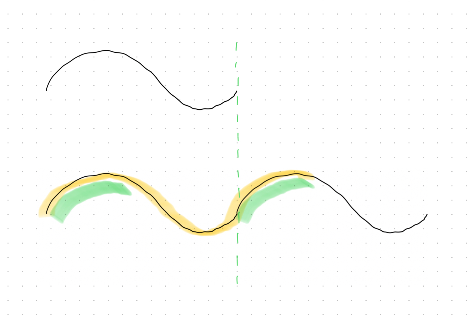
The yellow-marked line represents the solid segment that should be drawn as stroke-dashoffset transitions from 1000 to 0. The green-marked segment, exceeding the path length, will restart from the path’s start point. Since this part has already been drawn, it appears as a delay between enter animations.
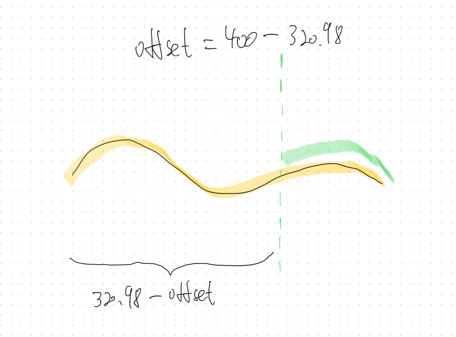
To better understand stroke-dasharray and stroke-dashoffset, let’s consider an example where stroke-dasharray is smaller than stroke-dashoffset. For instance, if a heartbeat line has a length of 320.9864009752722(a real value), and stroke-dasharray="320.9864009752722" stroke-dashoffset="400".

The line first appears around 3/4 of the path, then the entire path is drawn, and finally, it disappears.
-
With
stroke-dasharray="320.9864009752722", the dashed pattern is:solid segment(320.9864009752722) - blank segment (320.9864009752722) - solid segment (320.9864009752722)
-
With
stroke-dashoffset="400", 320.9864009752722 units of solid segment are skipped, followed by 79.0135990247278 units of blank segment. -
Starting from the path’s origin, 241.9728019505444(320.9864009752722 - 79.0135990247278) units of blank segment are drawn, then 79.0135990247278 units of solid segment. After that, the dashed pattern resumes: 320.9864009752722 units of solid , followed by 320.9864009752722 units of blank, repeating.
-
As stroke-dashoffset animates from 400 to 0, the line starts from 241.9728019505444 and ends when stroke-dashoffset reaches 320.9864009752722, making the line disappear and restart from the start point to the end point.
So the problem becomes how to determine the length of each heartbeat line. Once we know the exact length, we can set the value of stroke-dasharray to that value and animate stroke-dashoffset from that value to 0, ensuring the line disappears immediately after entirely appearing, which is the desired timing.
Since the line consists of 82 points connected by line segments, it is easy to calculate its total length using the Pythagorean theorem.
1// only use M and L
2
3const segmentRegExp = /([ML])([^ML]*)/g
4
5const parseCoordinate = (args) => {
6  return args.split(" ").map(Number)
7}
8
9const parsePath = (path) => {
10  const segments = path.match(segmentRegExp)
11
12  return segments.map((item) => {
13    const command = item[0]
14
15    const coordinateValues = parseCoordinate(item.slice(1))
16
17    return [command, ...coordinateValues]
18  })
19}
20
21const calculatePathLength = (pathStr) => {
22  const pathSegments = parsePath(pathStr)
23
24  let cur = [0, 0]
25
26  let length = 0
27
28  // segment = ["M/L", x, y]
29
30  for (const segment of pathSegments) {
31    if (segment[0] === "M") {
32      cur = [segment[1], segment[2]]
33    } else if (segment[0] === "L") {
34      length += Math.sqrt(
35        Math.pow(cur[0] - segment[1], 2) + Math.pow(cur[1] - segment[2], 2),
36      )
37
38      cur = [segment[1], segment[2]]
39    }
40  }
41
42  return length
43}
This creates an animation where the line restarts immediately after entirely appearing.
However, the heartbeat line on the right is noticeably longer than the left, causing the overall animation to be slightly faster (the duration of both is 3s). While the middle curve is inherently longer than the straight lines, making the animation faster in the middle, I prefer to concentrate the speed increase on the middle curve to better match real-world behavior.


So, we need to define the keyframes. As each heartbeat line starts and ends with a 60-unit straight line, the animation could be defined like this:
1#avater-line {
2  animation: draw 3s infinite;
3}
4
5@keyframes draw {
6  0% {
7    stroke-dashoffset: 320.9864009752722;
8  }
9
10  33.3333% {
11    /* path length - 60  */
12    stroke-dashoffset: 260.9864009752722;
13  }
14
15  66.6666% {
16    stroke-dashoffset: 60;
17  }
18
19  100% {
20    stroke-dashoffset: 0;
21  }
22}
The code above divides the animation into three equal parts:
- the first third displays the initial straight line
- the second third shows the middle curve
- the final third reveals the last straight line
Since the length of the straight lines is fixed, they follow the same timeline in the animation.


Exit Animation
Luckily, we found the end time of the enter animation, but it’s challenging to tell another element, “Hey, it’s your turn.”
In traditional CSS, this would usually be handled by JavaScript. Fortunately, SVG offers the <animate> element.
It includes a useful begin attribute, which specifies when an animation should start.
With this, the animation starts with the enter animation, ends with the exit animation, and then immediately restarts the enter animation, looping continuously, rather than just using "infinite".
Therefore, the original enter animation needs to be rewritten from CSS to <animate>.
1<!-- Another animation will reference this one via the id **enterAnimation**. -->
2<!-- begin recognizes the end time of the <animate> element with the id **exitAnimation**.-->
3<animate
4    id="enterAnimation"
5    attributeName="stroke-dashoffset"
6    values="320.9864009752722;260.9864009752722;60;0"
7    keyTimes="0;0.3333333333333333;0.6666666666666666;1"
8    dur="0.8s"
9    begin="0s;exitAnimation.end"
10/>
11
The begin attribute has various value types, but we mainly use two here:
-
offset-value
Setting it to 0s triggers the enter animation as soon as the SVG appears.
-
syncbase-value
Setting it to exitAnimation.end triggers the enter animation when the exit animation ends, regardless of its specifics.
There are a few other values related to events and absolute time, but I won’t go into detail here.
Now, it’s time to consider the exit animation.
SVG provides <mask>, which defines how to composite the current element with an alpha mask.
Using fill="white" makes everything beneath the element visible, while fill="black" makes it invisible. We can create a black-filled rectangle and animate its width from 1 to 280 to gradually cover the heartbeat line.
Additionally, for the fading trail, since the masking element in <mask> is a regular <rect>, we can use filter. However, when setting the x value of the <rect> inside the mask, we need to consider the blur.
Also, the syncbase-value of begin supports appending an offset-value, allowing the animation to start before the enter animation ends. I set the exit animation to start when the enter animation reaches 3/4 of its duration, achieving the effect of disappearing before entirely appearing.
1<g transform="translate(60, 60)" mask="url(#disappear-mask)">
2	<g filter="url(#blur)">
3		<path id="avater-blur" d="M-52 80 L0 80 ..." stroke="rgb(165, 240, 218)" stroke-width="6" stroke-miterlimit="10" stroke-linecap="round" stroke-linejoin="round" stroke-dasharray="320.9864009752722">
4			<animate
5				id='enterAnimation'
6				attributeName="stroke-dashoffset"
7				values="320.9864009752722;260.9864009752722;60;0"
8				keyTimes="0;0.3333333333333333;0.6666666666666666;1"
9				dur="3s"
10				begin="0s;exitAnimation.end" />
11		</path>
12	</g>
13
14	<!-- same path and animation -->
15
16</g>
17
18
19<defs>
20	<mask id="disappear-mask">
21		<!-- make the entire line visible -->
22		<!-- considering the line’s stroke width, the x value should be less than -52 -->
23		<rect x="-56" y="0" width="280" height="160" fill="white" >
24		</rect>
25		<!-- make the width of the invisible area grow from 1 to 280 -->
26		<!-- considering the mask’s blur, the x value should have a larger offset to cover the entire line -->
27		<rect x="-66" y="0" width="0" height="160" fill="black" filter="url(#mask-filter)">
28			<!-- 3s - 0.75s -->
29			<animate attributeName="width" id="maskA" begin="enterAnimation.end-0.75" from="1" to="280" dur="3s" />
30		</rect>
31	</mask>
32
33	<filter id="mask-filter">
34		<feGaussianBlur in="SourceGraphic" stdDeviation="10" />
35	</filter>
36	...
37</def>
However, part of the top and bottom glow of the heartbeat line is missing, which is quite frustrating.

The reason is that the default scope of <mask> applies to the target element’s bounding box, defined by its actual width and actual height, excluding the blur from the filter. The remaining shadow is visible because the mask’s default y is -10% and its height is 120%.
To address this, I increased the mask’s application area by adding a circle, with a radius equal to half the curve canvas's height, centered inside the target element.
1<g transform="translate(60, 60)" mask="url(#disappear-mask)">
2	  <circle cx="80" cy="80" r="80" fill="transparent"/>
3	  ...
4<g>
Wrapping Up
We now have a heartbeat line with a grow effect, animating as expected, and it nearly meets all the requirements.


What's the next?
The heartbeat line is out, and the following still needs to be addressed:
-
Map the activity count to the heartbeat rate, and display it centered within a bounding box below.
-
The color should change as the heartbeat rate increases, transitioning from cyan to beige, then to rust.
-
The animation speed should increase or decrease based on the heartbeat rate.


Stay turned, I will be back soon.